My February 5 presentation at the Pinole Artisans monthly meeting continues to go around in my mind. The Zoom interaction with others kept me on my toes and the emphasis on discovery through finishing up old sketches and using paint that would otherwise dry up and be be wasted continues to keep me finding unfinished projects to get done. But what does that have to do with poetry?
In many historic times and in cultures around the world, words and pictures have been used together. In some places they still are. In our society, words and pictures gradually separated so that when I was in college I was faced with chapter after chapter of monotony. Even early printings of the Gutenberg Bible left space for beautifully illuminated capital letters, most with vignettes of daily life worked in.
But somewhere along the line, I was taught that pictures were for “baby books,” and that when I "grew up” I’d learn to read without the “need” of pictures.
Baloney!
Pictures and words go together like coffee and doughnuts, ice cream and cake, salad and garlic bread, udon and shrimp, sizzling rice and bok choy, green eggs and ham!
Travel books are a great example. What would they be without the photos? All our “how to” books use pictures and diagrams (sometimes more convenient than an online tutorial).
What I’m very interested in is art in which words and pictures are closely connected. A visual image is not illustrating a text — the two are part and parcel of each other. The best example I can think of is Chinese and Japanese ink painting where a group of words directly connects with a visual image. In medieval Europe, visual images in books also linked with texts, slowing a reader down, encouraging thought and asking people to linger over a page.
Much the same encouragement to slow down and focus is implied in calligraphic text in large letters around the domes of Moslem houses of prayer. In Moslem cultures, as well as in Central Europe and Africa, exteriors of buildings are decorated with images and designs that encourage us to slow down and give conscious attention to what we are looking at.
I once had the opportunity to see this interaction between word and picture happen before my eyes at the original University Art Museum in Berkeley. (Please bear with me if you’ve heard me go on about this experience on another occasion.)
The Museum had an exhibit of Chinese calligraphy from different historic periods, some of it quite old. Calligraphers gave live demonstrations during the show. The wonderful open architecture of the museum interior allowed people to look down from multiple levels to watch the demonstrations and see the exhibited work at the same time.
One of the calligraphers was my Tai Chi master, Li Li-Da. He said in Tai Chi class that he had not done calligraphy in a while and was looking forward to the opportunity. When his table was set up and he was to begin, I noticed he was uncharacteristically hesitant. His hand even shook! I had never seen his fingers shake before! All the same, Li Li-Da began his brushwork. I could tell it was hesitant. He even dropped a few blobs of ink that it was clear he had not intended to do!
What could save this lack luster demonstration? The poem he wrote transcended every hesitation and all the blobs.
The poem was in Chinese. Li Li-Da translated it for the audience. His translation was something like this:
Surrounded by masters,
Humbled by their excellence,
My hand trembles at the power
On the walls in front of me.
Yet something i n the ink strokes
Leads me on.
Not only had Li Li-Da “recovered” from what was clearly unintentional, he himself had mastered the situation!
A lot of art in any medium is like that. The moment we feel blocked is the moment to go on.
Bob Ross does this by blending. If something in our art is not the way we want it — blend it in!
The new, maverick HBO series by musician-painter John Lurie, “Painting with John,” takes another direction. Starting out with a kudo of sorts to Bob Ross, “Bob Ross was wrong: not every tree is a happy tree,” Lurie shows what he is doing in close up after close up. His medium is gouache (pronounced in one syllable sort of like gah-wash). It is an opaque watercolor that Laurie lets you see over and over. The camera focuses on how the paint actually acts and how different brushes help create differing forms. As he paints, Lurie talks about everything except what he is doing and claims there is nothing to learn from him. He’s sarcastic, caustic, and generous.
Take a few drawings or paintings you are just about ready to throw out — or some full size sheets from a local newspaper that is almost ready to recycle. Paint something simple and big over the images. Maybe the word BIG. Or BIG. Or BIG! Or BIG! The visual impact is at least a little bit different with each size of text or color or form. And the text is brief enough to leave time to mull it over.
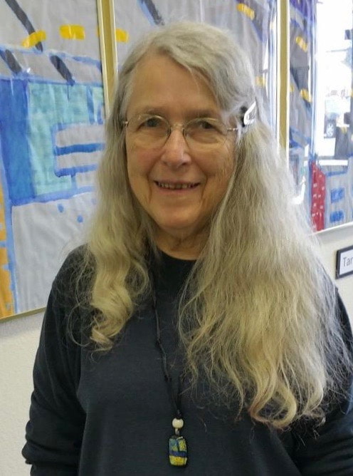
Tanya Joyce
Painter, Poet, Pinole Artisan
In many historic times and in cultures around the world, words and pictures have been used together. In some places they still are. In our society, words and pictures gradually separated so that when I was in college I was faced with chapter after chapter of monotony. Even early printings of the Gutenberg Bible left space for beautifully illuminated capital letters, most with vignettes of daily life worked in.
But somewhere along the line, I was taught that pictures were for “baby books,” and that when I "grew up” I’d learn to read without the “need” of pictures.
Baloney!
Pictures and words go together like coffee and doughnuts, ice cream and cake, salad and garlic bread, udon and shrimp, sizzling rice and bok choy, green eggs and ham!
Travel books are a great example. What would they be without the photos? All our “how to” books use pictures and diagrams (sometimes more convenient than an online tutorial).
What I’m very interested in is art in which words and pictures are closely connected. A visual image is not illustrating a text — the two are part and parcel of each other. The best example I can think of is Chinese and Japanese ink painting where a group of words directly connects with a visual image. In medieval Europe, visual images in books also linked with texts, slowing a reader down, encouraging thought and asking people to linger over a page.
Much the same encouragement to slow down and focus is implied in calligraphic text in large letters around the domes of Moslem houses of prayer. In Moslem cultures, as well as in Central Europe and Africa, exteriors of buildings are decorated with images and designs that encourage us to slow down and give conscious attention to what we are looking at.
I once had the opportunity to see this interaction between word and picture happen before my eyes at the original University Art Museum in Berkeley. (Please bear with me if you’ve heard me go on about this experience on another occasion.)
The Museum had an exhibit of Chinese calligraphy from different historic periods, some of it quite old. Calligraphers gave live demonstrations during the show. The wonderful open architecture of the museum interior allowed people to look down from multiple levels to watch the demonstrations and see the exhibited work at the same time.
One of the calligraphers was my Tai Chi master, Li Li-Da. He said in Tai Chi class that he had not done calligraphy in a while and was looking forward to the opportunity. When his table was set up and he was to begin, I noticed he was uncharacteristically hesitant. His hand even shook! I had never seen his fingers shake before! All the same, Li Li-Da began his brushwork. I could tell it was hesitant. He even dropped a few blobs of ink that it was clear he had not intended to do!
What could save this lack luster demonstration? The poem he wrote transcended every hesitation and all the blobs.
The poem was in Chinese. Li Li-Da translated it for the audience. His translation was something like this:
Surrounded by masters,
Humbled by their excellence,
My hand trembles at the power
On the walls in front of me.
Yet something i n the ink strokes
Leads me on.
Not only had Li Li-Da “recovered” from what was clearly unintentional, he himself had mastered the situation!
A lot of art in any medium is like that. The moment we feel blocked is the moment to go on.
Bob Ross does this by blending. If something in our art is not the way we want it — blend it in!
The new, maverick HBO series by musician-painter John Lurie, “Painting with John,” takes another direction. Starting out with a kudo of sorts to Bob Ross, “Bob Ross was wrong: not every tree is a happy tree,” Lurie shows what he is doing in close up after close up. His medium is gouache (pronounced in one syllable sort of like gah-wash). It is an opaque watercolor that Laurie lets you see over and over. The camera focuses on how the paint actually acts and how different brushes help create differing forms. As he paints, Lurie talks about everything except what he is doing and claims there is nothing to learn from him. He’s sarcastic, caustic, and generous.
Take a few drawings or paintings you are just about ready to throw out — or some full size sheets from a local newspaper that is almost ready to recycle. Paint something simple and big over the images. Maybe the word BIG. Or BIG. Or BIG! Or BIG! The visual impact is at least a little bit different with each size of text or color or form. And the text is brief enough to leave time to mull it over.
Tanya Joyce
Painter, Poet, Pinole Artisan
 RSS Feed
